
Logo design
Always make a good first impression
My Approach
Sometimes a brand needs a refresh, not a reinvention. I work with clients to refine existing logos, typography, and visual elements while preserving the recognition they've built.
Creating something new
A new identity begins with understanding the business and translating its personality into meaningful symbols and typography. Through sketches, exploration, and collaboration, I work toward a solution that feels distinctive and true to the brand.
Built to last
I start in black and white, making sure the mark and typography work before introducing color. The final identity must be versatile, recognizable, and ready to work across everything from digital media to print and signage.
A logo is more than a mark. It's the beginning of a brand's visual story.
Hotel Astor
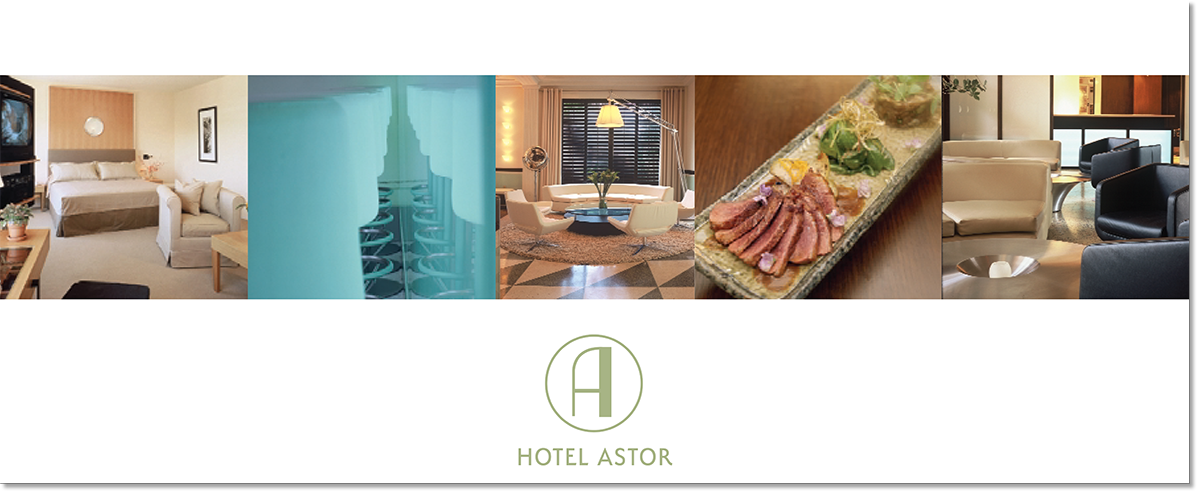
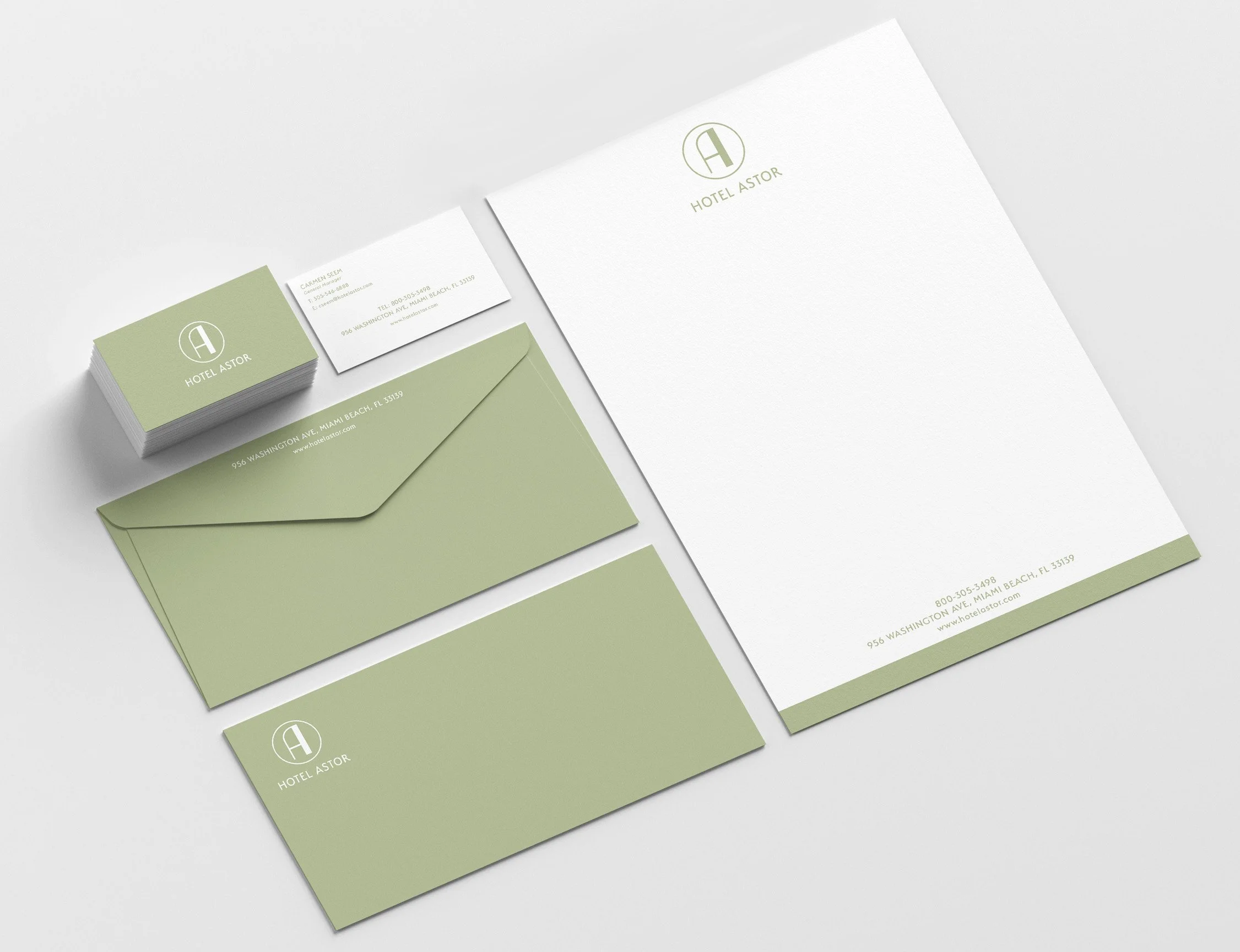
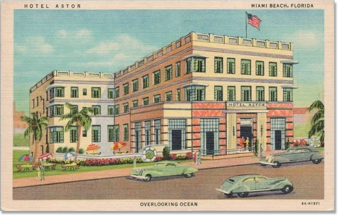
Built in 1939 in the heart of Miami Beach this hotel was built during the height of the Art Deco boom. I worked with an interior design team and the developer to create modern logo embracing it’s Art Deco roots. We chose the “A” from the Hotel Astor fascade and everything else fell into place.
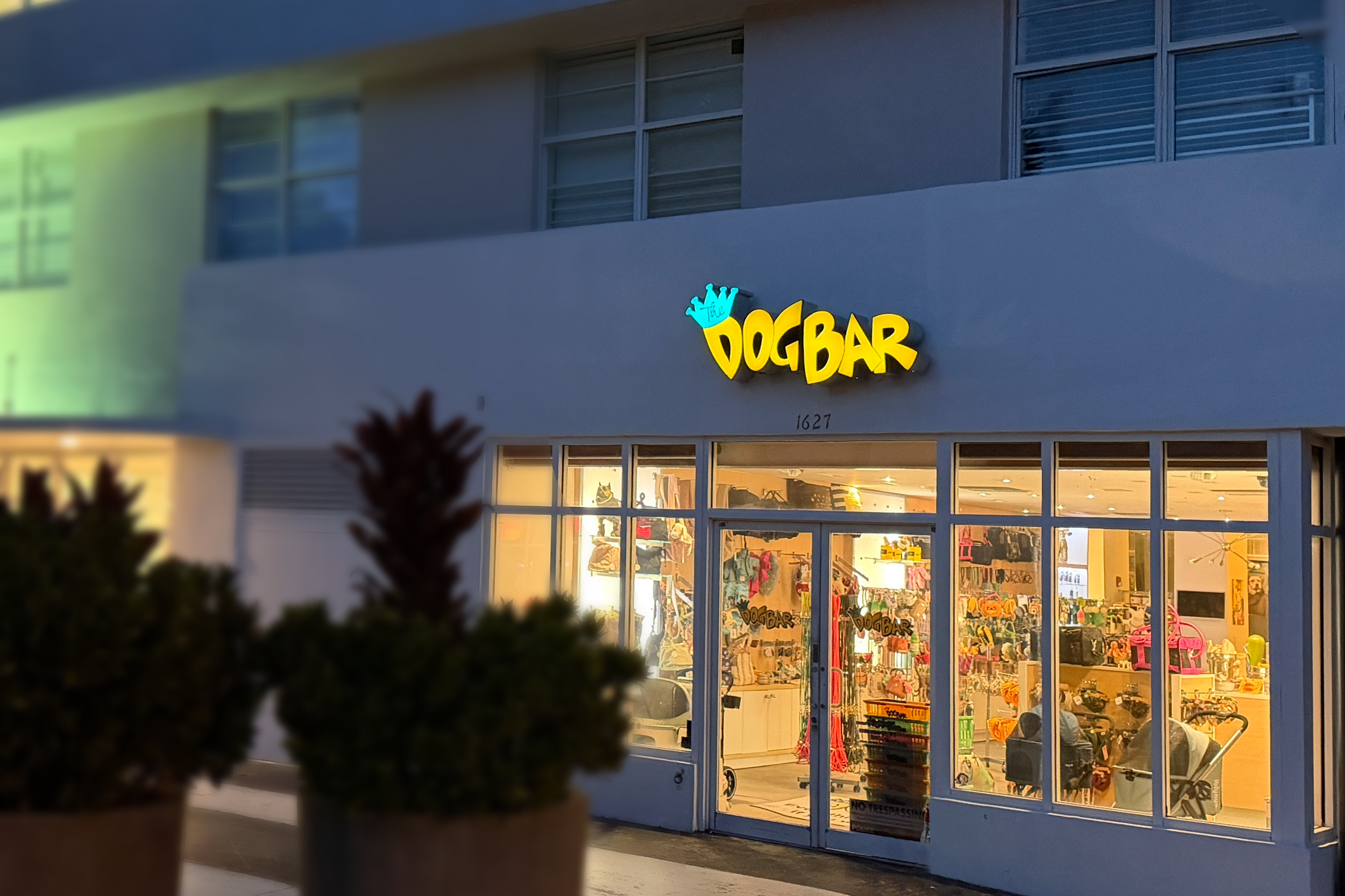
The Dog Bar
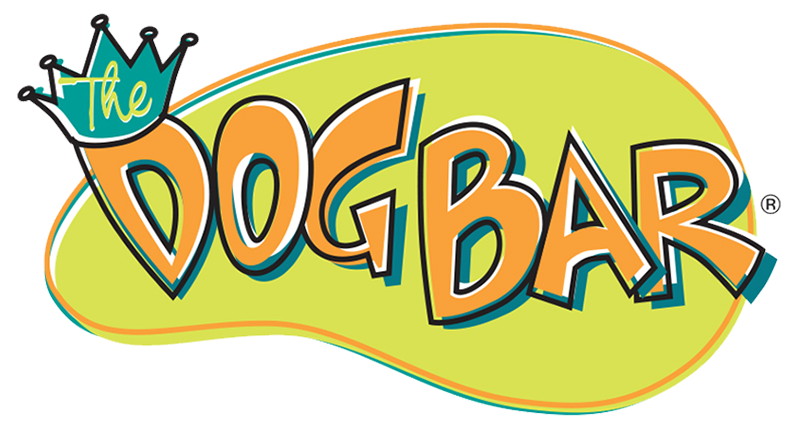
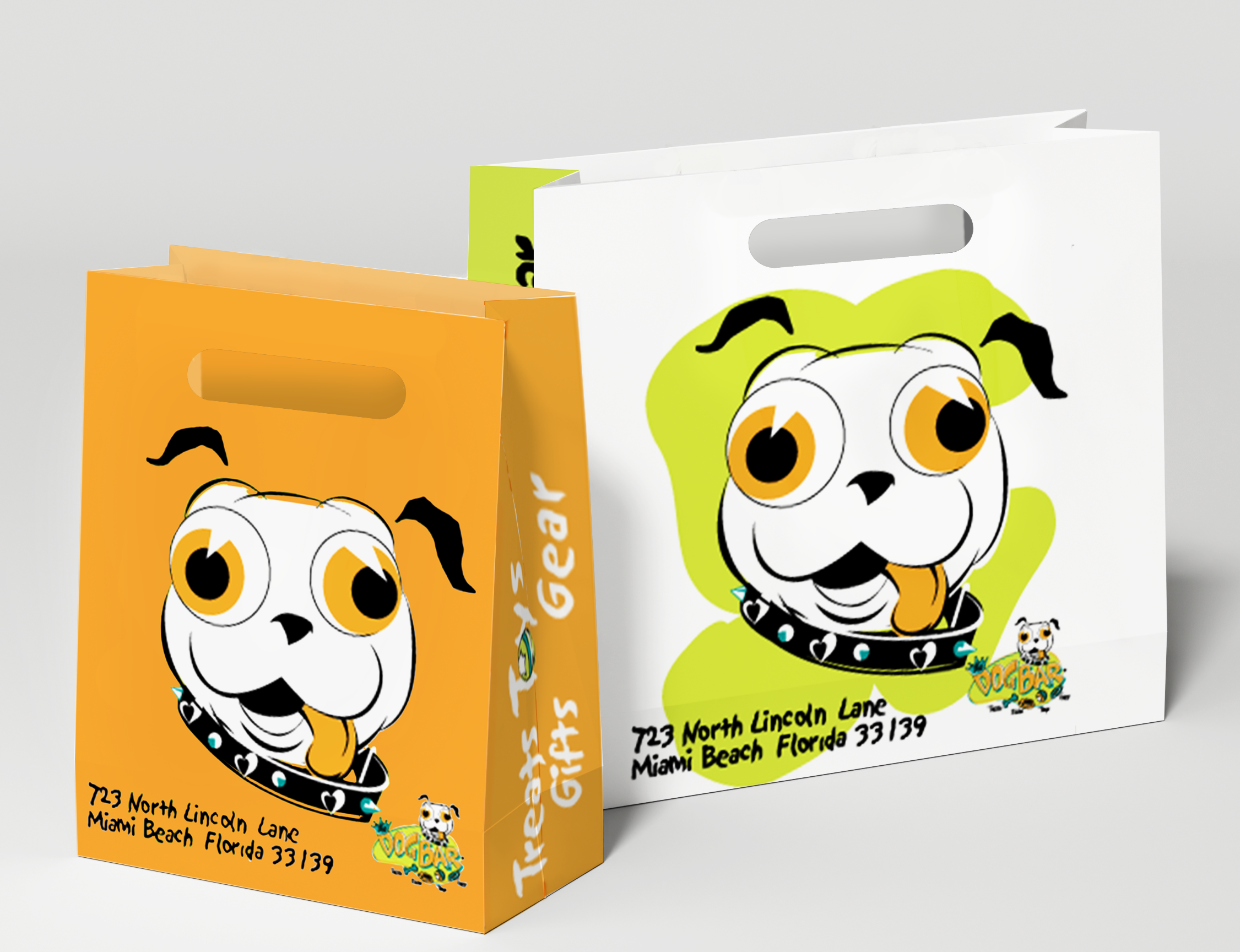
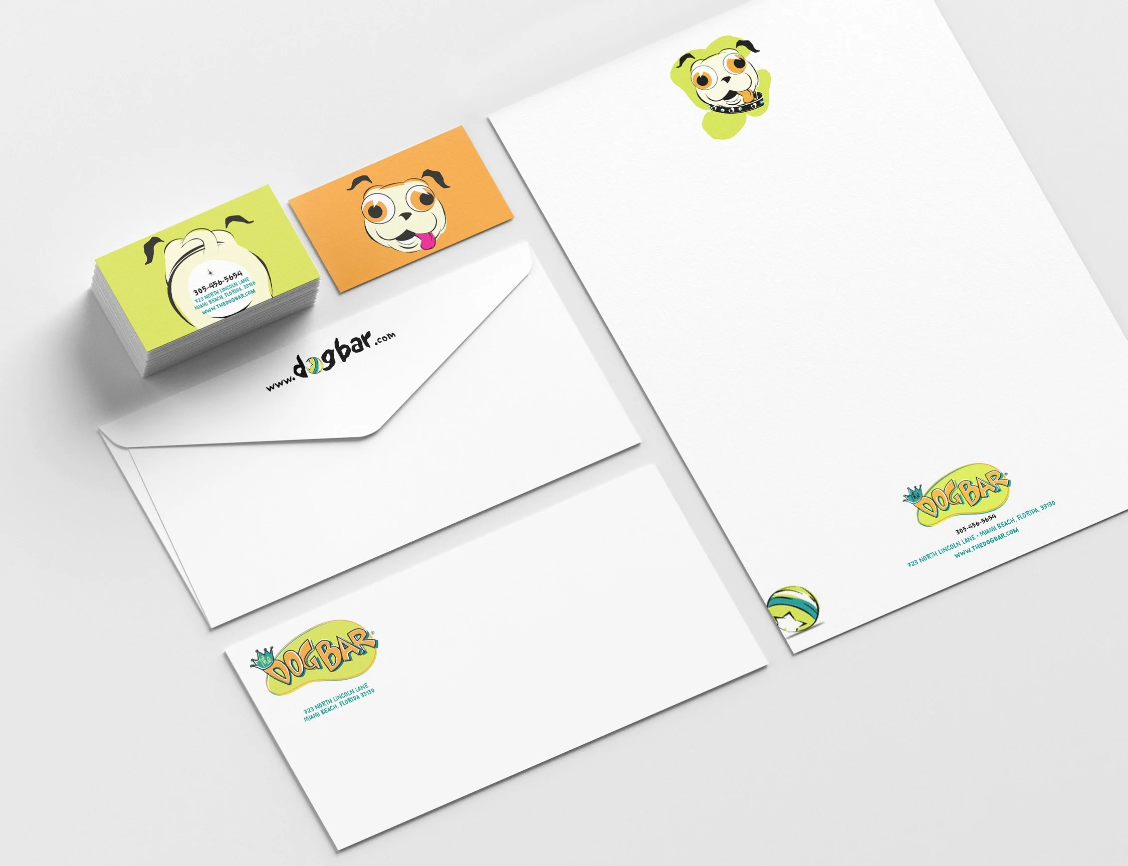
The owners to let me design a new logo for this Lincoln Road dog (and cat) boutique store. Their Pug, Maggie, was the store’s mascot so I focused on her and a colorful fun logo where pets are treated like family - maybe even better.
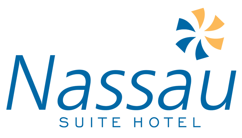
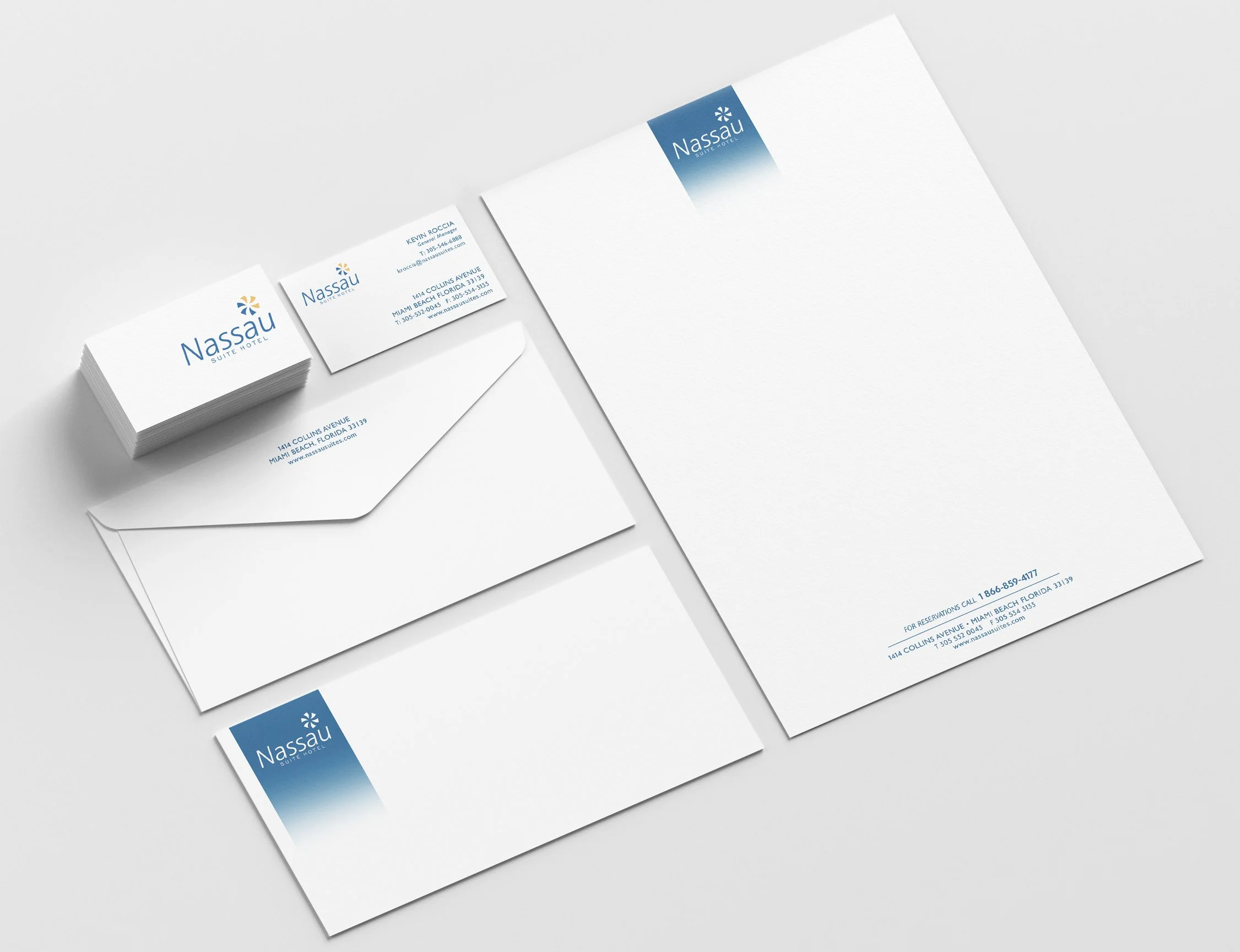
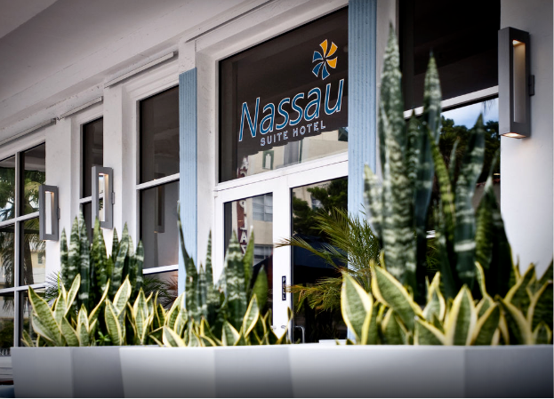
Nassau Suite Hotel
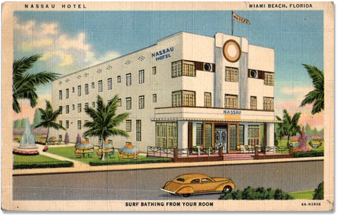
The Nassau Hotel in Miami Beach was built in 1936 and is in the historical register of historic places. The owner had converted it into a boutique suites and ask me to create a logo mark for them. The hotel is two block from the Atlantic so I chose a mark that represented sun and water, an umbrella or beach ball. The type is thin and modern not art deco to reflect the modern aesthetic.
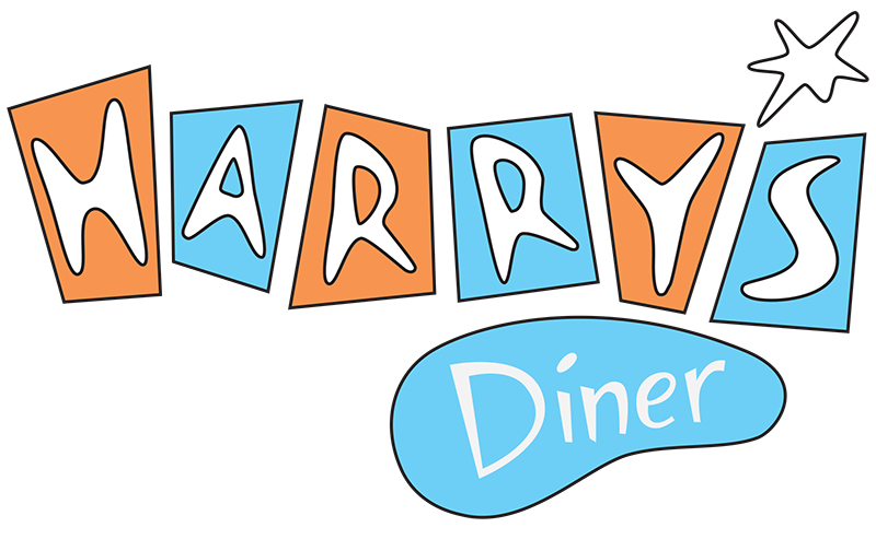
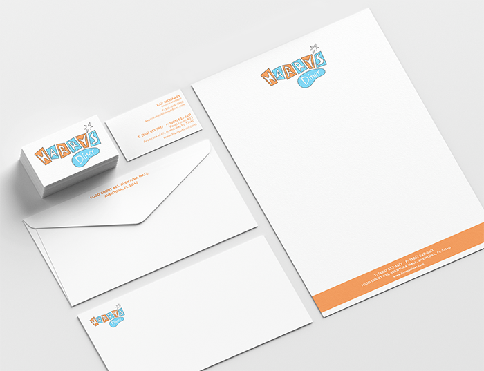
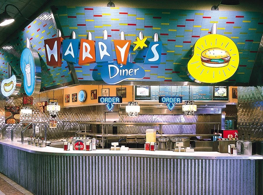
Harry’s Diner
I worked on this project for the food court in Aventura Mall with Patrick Kennedy. Patrick and I designed several dining spots in the mall where Patrick was also designing retail spaces. Harry’s has a great West Coast fifties feel.
The Palms
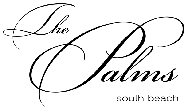
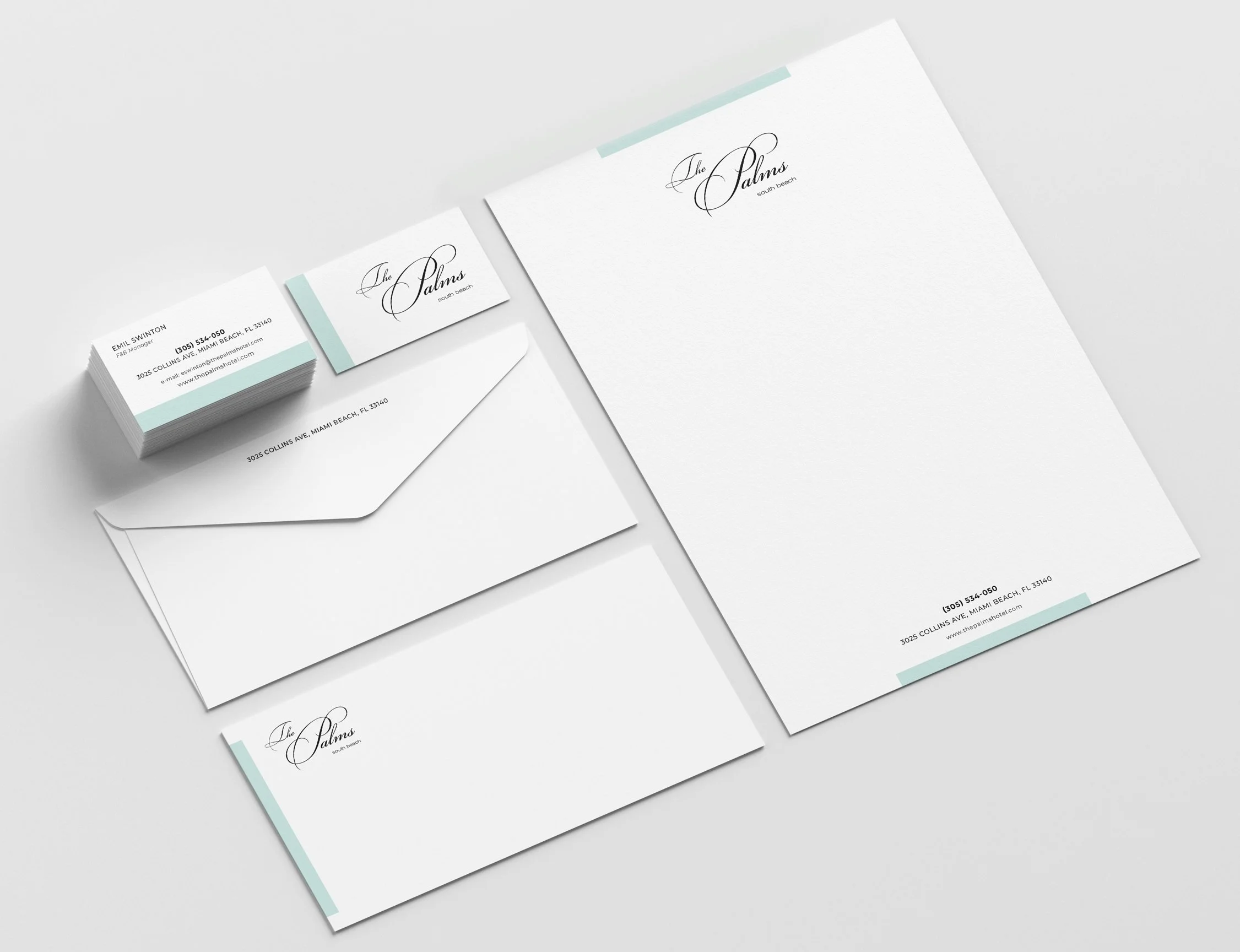
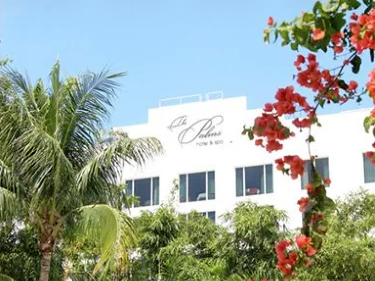
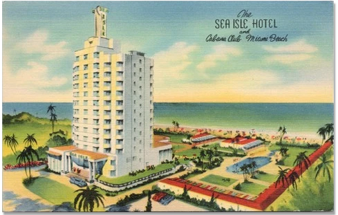
A four-star luxury family owned hotel and spa. The hotel originally opened in 1941 as the Sea Isle Hotel. Another project with designer Patrick Kennedy, I worked with the owners who wanted an elegant typeface.
Taiji Center
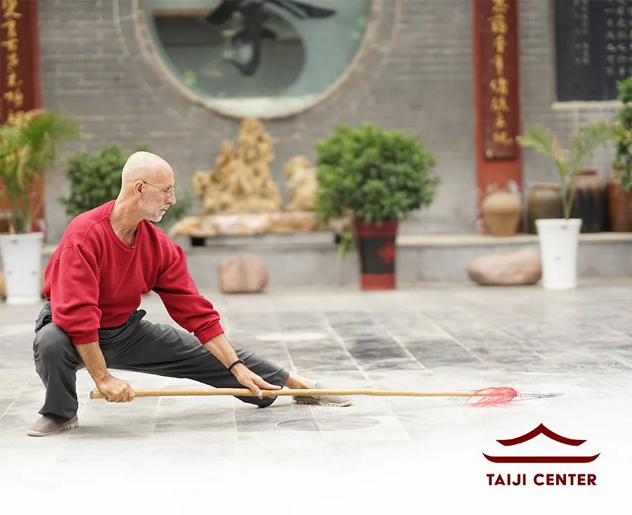
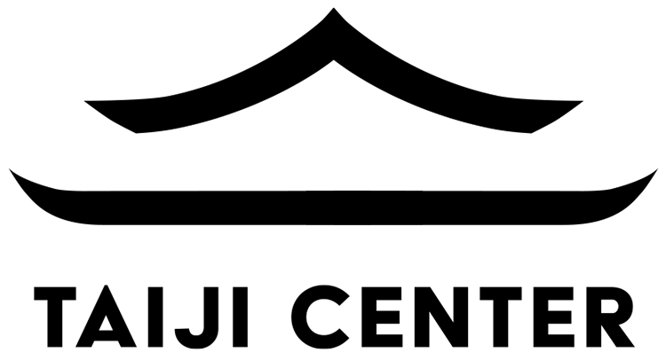
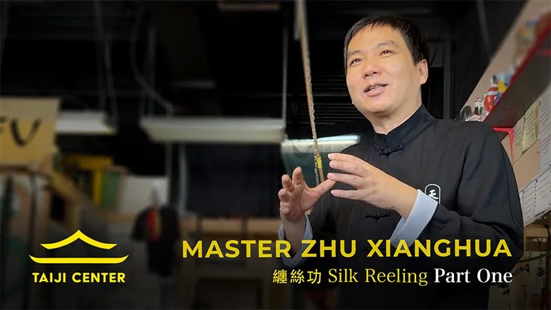
Steve Contes, instructor and founder of the Taiji Center began his martial arts over 50 years ago. He teaches traditional Chinese Martial Arts for health & self-defense. He introduce me to Tai Chi and I have traveled with him several times to China to train. We are good friends and I asked him if I could create a logo mark for him. We agreed on a asian influenced roof representing the center( his school). We explored ornate lines and types but striped down to only two lines I think is the strongest and a clean read.
Kaizen Media Solutions
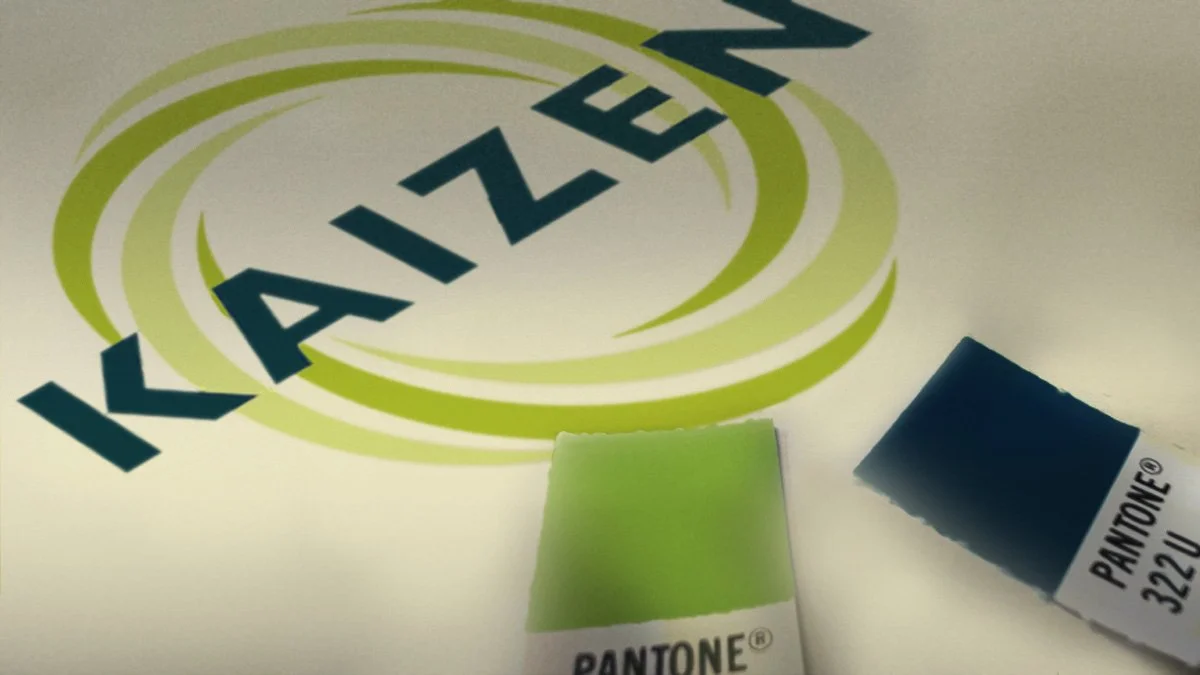
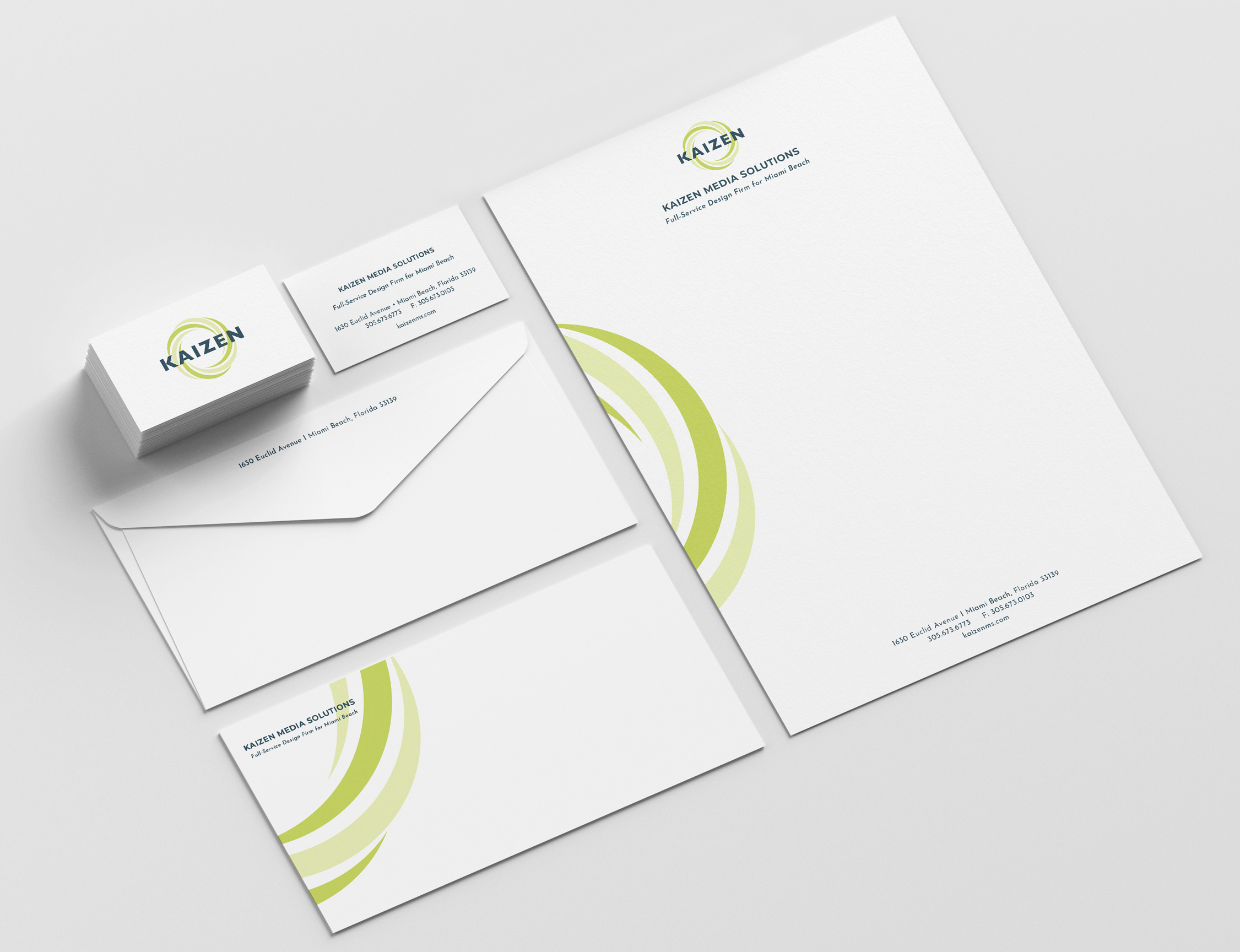
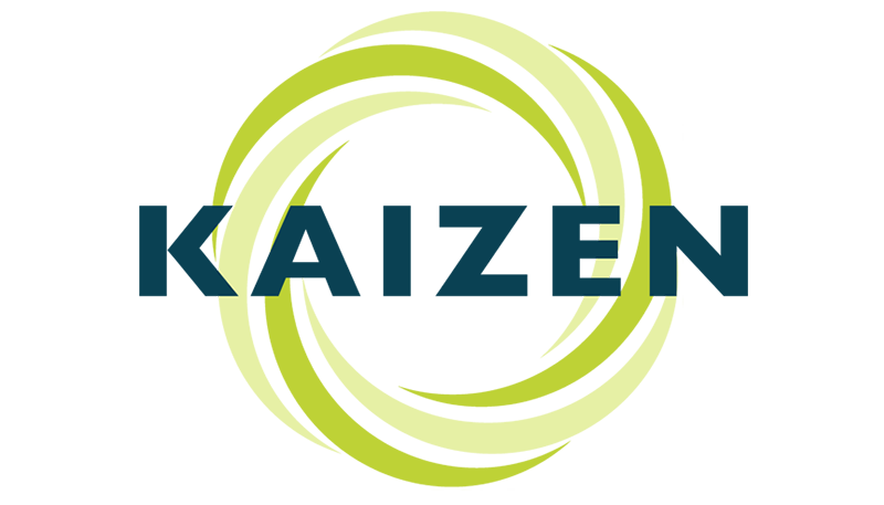
A design service agency that provided scanning, printing and design on Lincoln Road in Miami. I explored visual interpretations of Kaizen (改善) which translates and follows a philosophy of “Continuous Improvement.” We agreed a circle with an illusion of movement would best represent this idea. The colors reflect the time late 1990s.
© 2026, Mike Rivamonte. All rights reserved.